Table of contents
Introduction
Customers often use the testing product to conduct performance tests and check different parameters. They seek a continuous testing environment that can validate the application performance and optimize the same.
This is where the Performance Dashboard lets them plot the tests and metrics on a graph. The specific feature of this performance dashboard allows the users to select multiple tests along with the specific metrics they are interested in and view these parameters on a detailed graph.
What are the benefits of a Performance Dashboard?
- See how one metric can affect the performance of another.
- Pinpoint why performance improves or degrades over time.
- Select and view multiple parameters together to identify areas in need of optimization.
- Compare different testing environments to monitor change operations (Development, QA, Production, etc.).
Setting up a Performance Dashboard
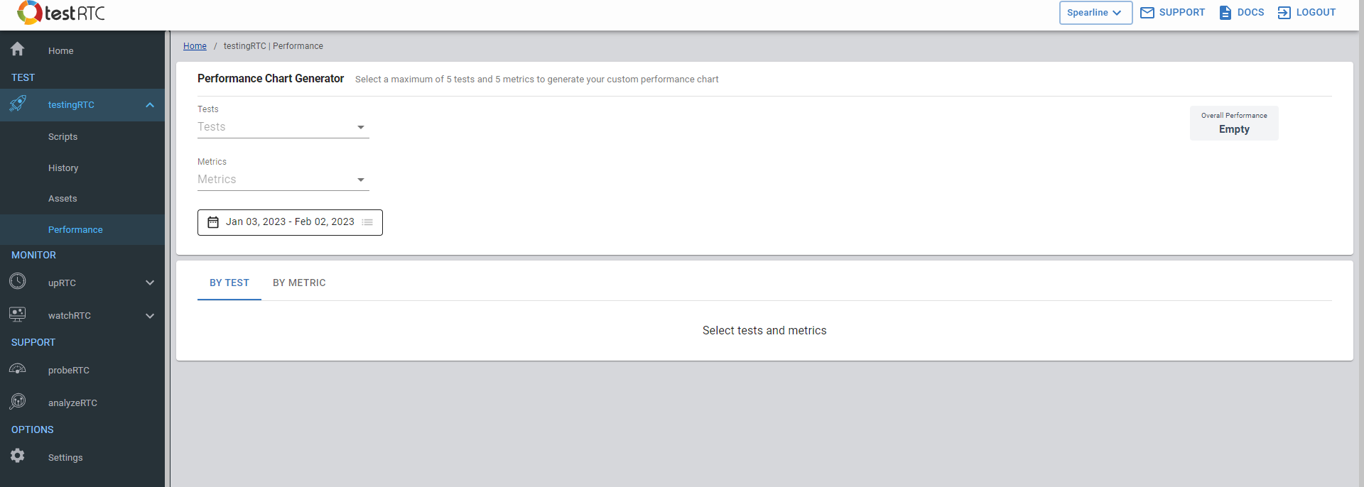
- Navigate to testingRTC > Performance
- Select up to five tests by clicking on the Tests drop-down menu and selecting the tests you are interested in. Repeat the process to add more tests.
- Select up to 5 metrics by clicking on the Metrics drop-down menu and selecting the metrics you are interested in. Repeat the process to add more metrics.
- The default date range is set to 30 days. You can choose a custom date range as you prefer.
- The selected parameters will then be plotted on the graph and viewed using the “By Test” or “By Metric” view. For more info, see Viewing Parameters on the Graph.

Viewing Parameters on the Graph
The Tests and Metrics are automatically plotted onto the graph once you have selected them. You can view performance insights differently by choosing one of the following views to change how the chart is generated.
By Test:
When viewing by test, each graph represents a test, and all the metrics available for the test are stacked in the chart.
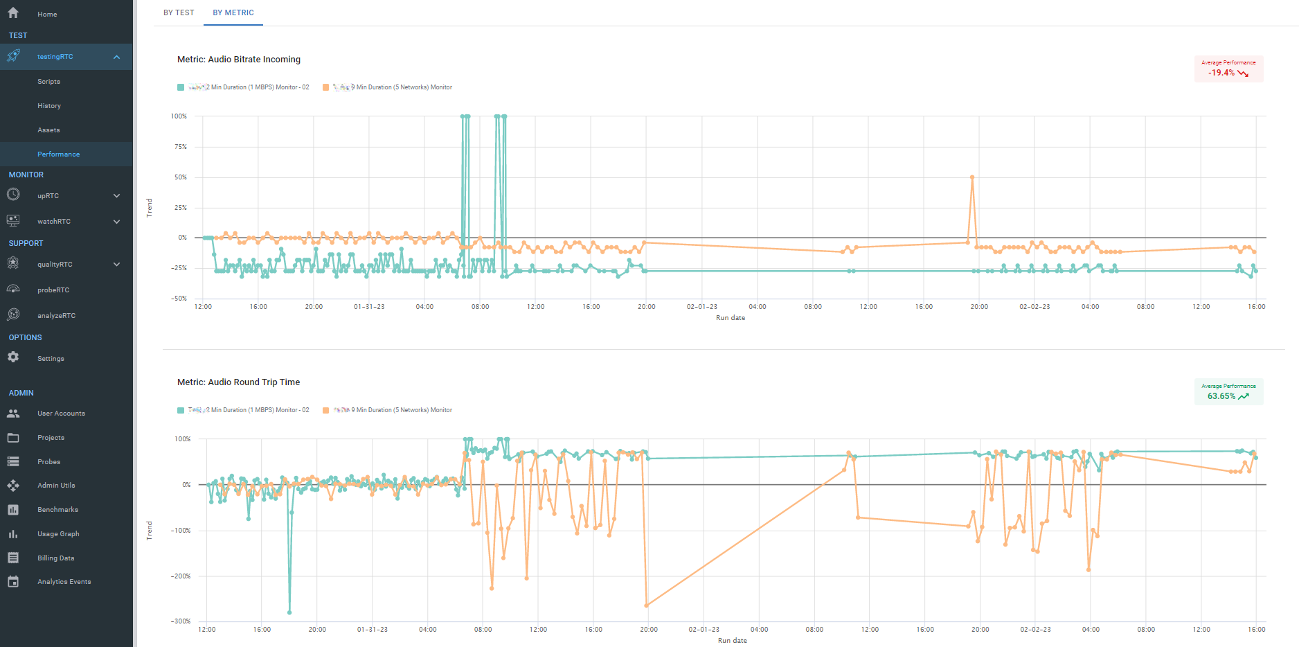
By Metric:
When viewing by metric, each graph represents a single metric, and all tests that include that metric are stacked in the chart.
By Test:
Selecting the “By Test” view, you can view a particular test with all the associated metrics you have selected. You will see multiple graphs depending on the number of tests you have selected.
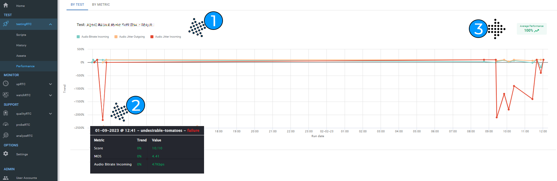
- Show/Hide Metrics: By clicking on the colorful parameters just above the graph, you can show/hide the metrics presented on the graph.
- Drill down: Moving the cursor to different areas on the graph shows you the exact trends and values for each parameter at that point.
- Average Performance Indicator: This indicator shows the average increase or decrease in the performance of a test during the selected date range.
By Metric:
Selecting the By Metric view, you can view a particular metric with all the associated tests. You will see multiple graphs depending on the number of metrics you’ve selected. Metrics for each test are only available if they were configured as part of the test.
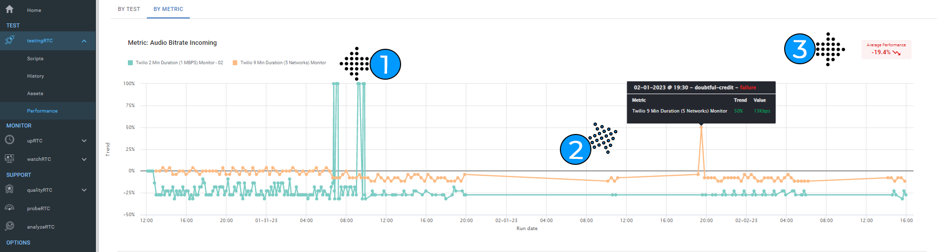
- Show/Hide Tests: By clicking on the colorful parameters above the graph, you can show/hide the tests presented on the graph.
- Drill down: Moving the cursor to different areas on the graph shows you the exact trend and value for each test. This will highlight the metric for the selected test at that given time during testing.
- Average Performance Indicator: This indicator shows the average increase or decrease in the performance of a metric during the selected date range.